Mapping tools for charities

By James Bowles, researcher at the University of Birmingham. This has been cross-posted from his summary of his Data4Good Festival talk on Third Sector Geography.
From 10-12 May 2021, the UK’s Data4Good Festival took place online and I gave a ‘how to’ session on mapping tools for civil society organisations. I ran through some examples, and thought it may be useful to provide links to the data sets and the tools. Some are free, and some require a subscription but offer nonprofit discounts. (NB: this presentation is an update of a similar one I gave at the 2018 Data4Good conference in Birmingham).
Google My Maps
Google My Maps is entirely free and part of the Google suite of tools. It’s fairly basic but does a great job of showing point locations (inc. postcodes) and boundaries. It can be easily customised and embedded on a website using an iframe.
To demonstrate this, I showed how we can plot the location of charities in Essex.
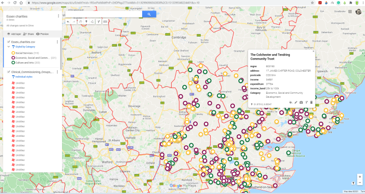
You can style the icons using the paint roller symbol on the left.
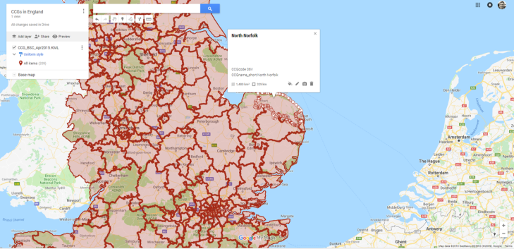
Google My Maps is also useful for displaying polygons, such as the boundaries of CCG’s in England. These files have to be KML format. You can get this (and lots more, including the comprehensive National Statistics Postcode Lookup) from the ONS’s Open Geography Portal or from the data.gov.uk portal.
The map can be shared with colleagues or it can easily be embedded on your website and any updates you make to the map in Google My Maps will carry through to the embedded map.
Other great postcode mapping tools
The second tool was the ‘Community Lens’. It has been developed by Hetco Design and allows a list of postcodes to be mapped against the English Indices of Multiple Deprivation and its subdomains. The charts on the left hand side can be screenshotted and put in grant applications etc.
For many programmes you will need to convert postcodes to lat / long, or you’ll need to append a statistical code in order to perform a spatial join between the tabular data and the spatial boundary file. David Kane has created Find That Postcode for adding spatial data to a CSV file, and Find That Charity for adding regulatory and organisational data. The Doogal website also offers a great set of tools, including geocoding.
Finally, OCSI’s Local Insight tool offers a wide range of mapping capabilities and datasets. It also offers customisable boundaries. You can see more about how Local Insight can be used here.
ArcGIS Online
ArcGIS Online is ESRI’s webmapping platform. ESRI once dominated the GIS scene, and while I much prefer the open-source QGIS for desktop mapping, ArcGIS Online is really intuitive and produces great visualizations. It is similar to Google My Maps in simplicity, but gives the user more choice. The public account is free, but you should note that to save your map you must agree to it being publicly available.
To demonstrate ArcGIS Online, I looked at the prevelance of loneliness among over 65’s in Wigan, against local charities that work in this domain.
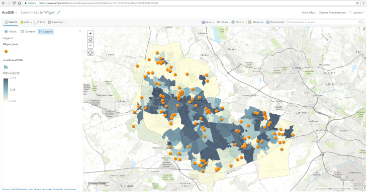
The most common vector format is a Shapefile (which actually contains several files). More info here. Wigan Council did once share their data on loneliness among 65+ year olds by LSOA on their open data portal, but this has since been removed. However, it’s worth looking more generally at local government data portals for spatial data. You can visualise data as a choropleth (like above) in ArcGIS online, or as a heatmap. You can also create a slideshow with interactive maps. More information on styling your map.
To download the Charity Commission data full register and build a database, NCVO and David Kane have developed a help guide. Since March 2021, you can now download individual parts of the register as text files.
QGIS
The third tool is QGIS. QGIS is a powerful desktop programme, that is free and open-source, meaning there are over 550 great plugins, including QGIS2Web, which outputs the files you need for a webmap. If you know any SQL, then you’ll love the query builder. There are plenty of tutorials and QGIS offers much more functionality than the webmapping tools displayed above.
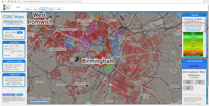
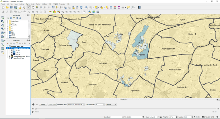
To demonstrate QGIS, we can explore in which wards in Birmingham do Somalian diaspora live, according to the 2011 census. Birmingham City Council are moving to a neighbourhood approach to social care, so if our organisation worked with Somali speakers, we would want to be sure to target our efforts in the right neighbourhoods. Data that goes beyond anecdotal evidence is useful for this.
To start with, we can download the census data from the Consumer Data Research Centre (CDRC). CDRC have lots of useful maps and datasets that are free to download. You can also overlay KML or GeoJSON files on to the CDRC maps.
Next we want the boundaries for census output areas and the wards across Birmingham. These can be downloaded in Shapefile format from the ONS’s Open Geography Portal and data.gov.uk.
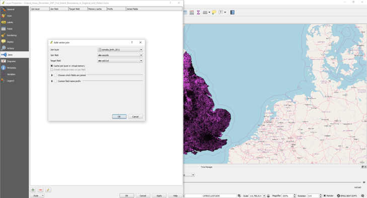
The 2 Shapefiles are loaded as vector layers, and the census data as delimited text (no geometry, attribute only). We then need to join the census data and the census output areas using the shared output area code, shown below.
The data can then be styled and labels added. The final output is a map which clearly shows in which wards in Birmingham we should focus our efforts.
Using the QGIS2Web plugin, you can upload your map to a webserver using either OpenLayers or Leaflet. The plugin neatly packages up the code, leaving you with one .html file that displays the map. In lieu of my own server, I’ve used Amazon’s Web Services to host a map (which is free).
Final thoughts…
- Lots of the organisations I’ve come across have partnered with volunteers, universities or for-profit businesses to undertake geospatial work – you don’t always need to have the skills in-house.
- You may have access to Tableau, Alteryx, or Microsoft PowerBI, which all have varying mapping functions.
- You may already hold geospatial data…you just don’t think of it as such! Alot of data will have a postcode attached which you can easily map. Of course, be wary of sensitive data and GDPR processing rules, you can often aggregate data if this is an issue.
- For those interested in spatial statistics, GeoDa is a great and relatively straightforward package. If you’re interested in making use of R and RStudio for geospatial analysis, here’s a good intro, alongside An introduction to R for Spatial Analysis and Mapping by Brunsdon and Comber.
If you’d like to get updates from the Data4Good Festival, including more articles from speakers and great resources, please join our mailing list.
Watch James’ session from the Data4Good Festival 2021 below, and find more videos and sessions here.
https://youtu.be/XOYUwPhdHs8